If you want to take your understanding of probabilities to the next level, it’s crucial to be familiar with the concept of a probability distribution.
In short, a probability distribution is an assignment of probabilities or probability densities to all possible outcomes of a random variable.
For example, take the random process of flipping a regular coin. The outcome of each flip is a random variable with a probability distribution:
- P(“Heads”) = 0.5
- P(“Tails”) = 0.5
Depending on the type of random variable you’re working with, there are two general types of probability distributions: discrete and continuous. In this post, I’m going to give an overview of both kinds. And in follow-up posts I’m going to individually introduce specific frequently used probability distributions from each kind.
Let’s first get a quick reminder about sample spaces.
Table of Contents
The sample space of a random variable
The sample space of a random variable is a set that consists of all its possible outcomes.
If you’re not familiar with the distinction between random variables and deterministic variables, here’s a short definition.
An outcome is the simplest possible realization of the random variable. Meaning, for something to be an ‘outcome’, it shouldn’t be possible to break it into smaller outcomes.
In the die rolling example from the beginning, there are 6 possible outcomes: 1, 2, 3, 4, 5, and 6. Therefore, the sample space of the random variable is {{1}, {2}, {3}, {4}, {5}, {6}}. Simple enough.
Well, if I were to be nit-picky, I would also include the tiny possibility of a die landing on one of the edges, or even one of the vertices (or maybe even not landing at all). But for now let’s indeed keep things simple.
Depending on your interests, you could also define the outcomes of the sample space to be more complex events. You can form those by combining simple outcomes of the original sample space (if you’re not familiar with the concept of events in the context of probability theory, you can make a small detour and read my post on compound event probabilities). Then you would treat those events as atomic outcomes. That is, in the context of your sample space, they would be unbreakable.
Let’s see how.
Alternative sample spaces
In general, an event is a combination of one or more simple outcomes of a random variable. Defining a sample space requires a set of non-overlapping events. That is, an elementary outcome should be a member of only one event. This will allow you to treat the complex events as elementary outcomes in the context of your sample space.
Here are a few ways to do that for our example random variable:
- Six events: {{1}, {2}, {3}, {4}, {5}, {6}}, where each event is a single outcome (the original sample space)
- Two events: {{1, 3, 5}, {2, 4, 6}}, where one of the events represents the odd number outcomes and the other represents the even number outcomes
- Three events: {{1, 2}, {3, 4}, {5, 6}}, where each event represents a pair of consecutive numbers
- One event: {{1, 2, 3, 4, 5, 6}}, which corresponds to the entire sample space. This event is guaranteed to occur for each realization of the random variable (hence, this choice of a sample space would technically make it a deterministic variable).
Say you take the set {{1, 3, 5}, {2, 4, 6}} to be your sample space. This choice implies that you only care if the outcome is an odd or an even number. So, even though the {1, 3, 5} element could technically be broken down to the elementary {1}, {3}, and {5}, this distinction would be irrelevant in the context of your sample space.
From sample spaces to probability distributions
Once you have a sample space, you need to assign probabilities to each of its elements (the outcomes). Of course, this assignment must be consistent with the axioms of probability theory (Kolmogorov’s axioms).
The mathematical object that represents a probability distribution is called a function. Informally, a function is something that takes a value (the input), does some calculation, and returns another value (the output). If you want to learn more about mathematical functions, check out my dedicated post.
In the case of probability distributions, the input is a specific outcome and the output is its probability (or probability density).
Take a look at this graphical illustration of the probability distribution of a die roll:
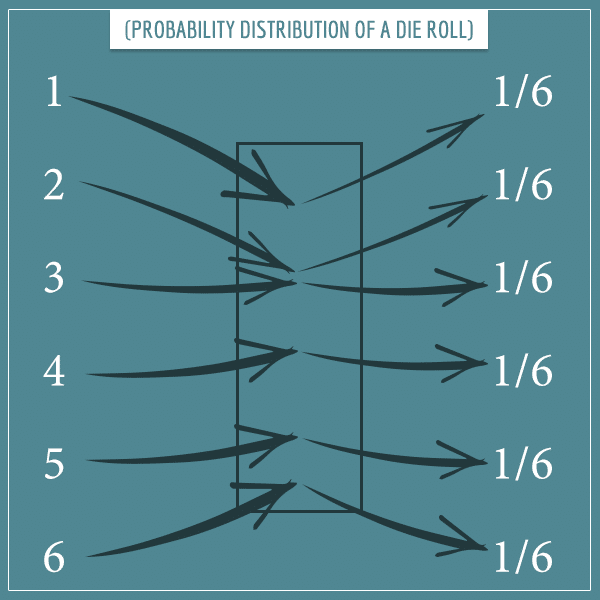
Here, the box in the middle represents the function that maps the possible outcomes to their respective probabilities. Since we’re assuming a fair die where all outcomes are equally probable, they each have a probability of 1/6.
If you choose a different way of constructing the sample space, then the probability distribution will be different. For example, if you choose the outcomes of the sample space to be {{1, 2}, {3, 4}, {5, 6}}, then the function will look like this:
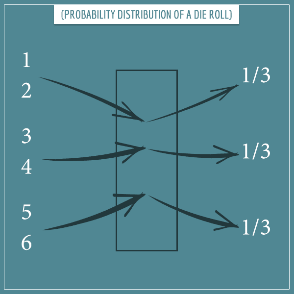
Notice that the sum of all probabilities is always equal to 1. This comes directly from probability axioms. Namely, the probability of the entire sample space must be equal to 1.
Discrete and continuous variables
When we have a discrete random variable, the function representing its distribution is called a probability mass function. On the other hand, if the random variable is continuous, the function behind the distribution is called a probability density function.
I gave a detailed explanation of the distinction between probability masses and probability densities in my post discussing zero probabilities. In fact, if you’re hearing these terms for the first time (or otherwise have difficulties following the rest of this section), I strongly encourage you to take a look at that post.
To get a better understanding of probability distributions, it’s very helpful to visualize them. So, let’s take a look at the two types of probability distributions with some visual intuition.
Discrete probability distributions
Discrete probability distributions are used for discrete random variables.
Intuitively, a variable is discrete if it has a set of distinct outcomes with “gaps” between them. That is, there are no possible outcomes that lie “between” any other 2 possible outcomes.
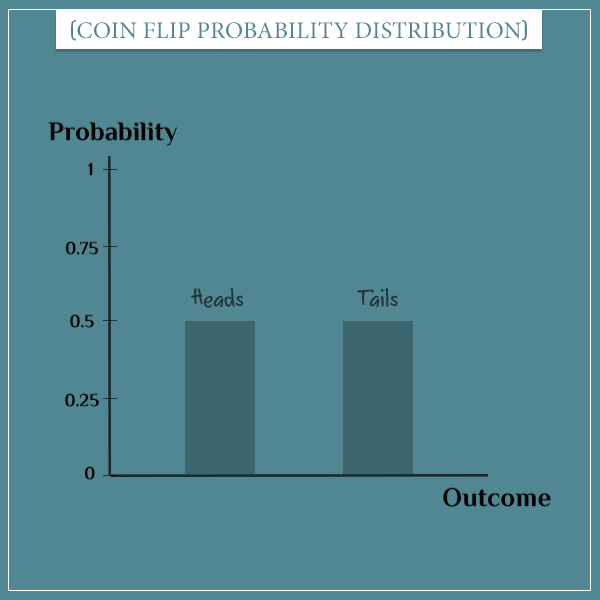
Bar plots are a natural way for visualizing discrete probability distributions. For example, here’s how you can represent the probability distribution of flipping a coin:
And here’s how you can represent the probability distribution of rolling a die:
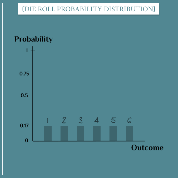
Both of these examples are of discrete variables, since there are no defined values between any pair of outcomes. In other words, outcomes like 2.4 and 5.1 aren’t possible when rolling a die. Similarly, you don’t have “almost heads” or “some tails” in the sample space of flipping a coin.
You can think of the height of each bar in the plots above as representing how much of the total probability mass its corresponding outcome holds.
A probability mass simply refers to the traditional notion of probability. As always, the total probability mass is equal to 1.
Would you like to get more intuition about discrete probability distributions and see examples of some of the most frequently used ones? Check out my post specifically dedicated to discrete probability distributions!
Continuous probability distributions
In a continuous random variable, between any 2 of its possible outcomes, you have infinitely many other possible outcomes. That is, there are no “gaps” between the outcomes.
With discrete variables, you can “discretely” distribute the total probability mass among each of the distinct outcomes. But because a continuous random variable has an infinite number of possible outcomes in any sub-interval of its domain, you can’t do the same here.
In short, the reason is that you would end up with a sample space whose total probability mass is infinity, because you would need to add up an (uncountably) infinite number of finite probabilities for each outcome.

For example, if your random variable is the height of a randomly picked pine tree from a specific forest, its possible values are all positive real numbers within certain boundaries. A tree’s height could be, say, 15 meters, or 15.2 meters. Or 15.48252192 meters. All (infinitely many) numbers between the “minimum” and the “maximum” heights are possible (whatever they may be).
Hence, each possible outcome doesn’t have a probability mass directly assigned to it (in fact, the probability of each exact outcome would be equal to 0).
Instead, outcomes are assigned a probability density. “Probability mass per unit length of sample space” is a somewhat informal way of defining probability densities. This is analogous to physical densities, defined as mass per unit of length/area/volume.
In the pine tree example, a probability density would be “probability mass per unit of height”.
Each point from the sample space has a probability density. Hence, the probability density function simply assigns a probability density to each possible outcome.
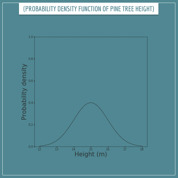
Curves are convenient for visualizing probability density functions. Here’s how you can represent the probability density function of the height of a pine tree:
Reading probability density functions
With probability mass functions, you can determine the probability of an outcome by simply looking at its value on the plot. But you can’t do that with probability density functions. In other words, the probability of a tree having a height of 15 m is not 0.4!
In fact, the probability of any specific value is 0. For continuous random variables, it only makes sense to talk about probabilities of intervals. That is, only intervals can have non-zero probabilities.
The probability of an interval is given by the area under the curve over the interval. For example, the probability of a tree having a height between 14.5 and 15.5 would be equal to the following shaded area:
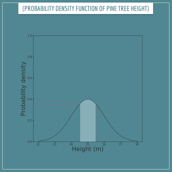
What is this shaded area equal to? Well, it kind of looks like a rectangle with a curvy top. The length of its base is 1 and its average height seems to be somewhere around 0.37. So, the area is approximately 0.37 * 1 = 0.37.
Mathematically calculating the probability of an interval
Of course, in reality you shouldn’t be estimating this area visually, as there are mathematical ways to do that. Namely, it’s calculated through the mathematical operation called integration.
Some of you familiar with normal distributions (also simply known as “bell curves”) might recognize that the above curve follows a normal distribution with a mean of 15 and variance of 1. The definite integral between 14.5 and 15.5 (that is, the real area under the curve) of this distribution is actually about 0.383. This tells us that the probability of the height of a randomly chosen tree to be in the interval [14.5, 15.5] is about 0.383.
By the way, don’t worry if you’re not familiar with normal distributions or integrals. The main important point from this section is that probabilities of intervals are calculated by finding the area under the curve over them.
Also, don’t worry if the concepts related to continuous probability distributions I introduced in the past sections are completely new to you. If so, I would again strongly encourage you to read my post on zero probabilities. There I give some intuition about what probability densities are and why exact outcomes always have a probability of 0.
Probability distribution intuition
Now that you have some familiarity with the basic concepts around probability distributions, let’s see where they actually come from.
In an earlier post I introduced the law of large numbers. There I told you it was one of the most fundamental theorems in probability theory. In another post, I used it to give some intuition for expected value, which is another fundamental probability theory concept.
And now I’m going to use it again, this time to give you some intuition about probability distributions.
If you’re not familiar with the law of large numbers, feel free to take a look at my related post. In short, this law is a mathematical theorem that links probabilities of outcomes to their long-term frequency of occurring.
Relative frequency distributions and the law of large numbers
Let’s go back to the probability distribution of a single die roll:

Each outcome has a probability of 1/6. Now let’s generate some actual die rolls from this distribution.
I wrote a short code to simulate 1000 random rolls of a die and plotted the % of each outcome after each flip. This is called a relative frequency distribution because it gives the relative frequencies of the outcomes (the frequencies divided by the total number of rolls).
Click on the image below to see the animated simulation:
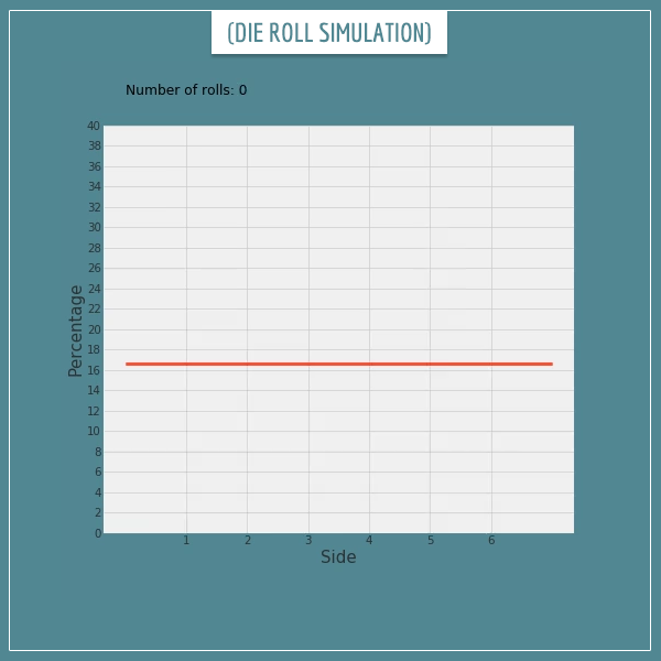
Click on the image to start/restart the animation.
Notice something? The relative frequency distribution looks very similar to the probability distribution from the plot above it. That is, the relative frequency of each outcome is very close to its probability. This should strongly remind you of what the law of large number says, yes?
Well, let’s make the number of rolls even larger. Look at the relative frequency distribution after 20 000 rolls of the die:

Click on the image to start/restart the animation.
This looks almost identical to the probability distribution of a single die roll, doesn’t it? You could probably guess that if I made a simulation of 1 million die rolls (or even more), the relative frequency distribution and the probability distribution would be even closer to each other.
The law of large number says that the relative frequency of an outcome approaches its probability as the number of repetitions approaches infinity. Then, a direct consequence of this statement is that the relative frequency distribution of a random variable will similarly approach its theoretical probability distribution.
In other words, the probability distribution of a random variable is nothing more than the theoretical limit of its relative frequency distribution as the number of realizations of the variable approaches infinity. Pretty neat!
The law of large number for continuous probability distributions
The simulations from the previous section were of a discrete random variable. But what about continuous variables?
As you can imagine, creating a relative frequency distribution by sampling from the probability distribution doesn’t quite work the same way here. If you simply took the relative frequencies of individual outcomes, you would end up with zeros almost everywhere. This is because the sample space of a continuous random variable is some interval on the real number line. Hence, the number of elements of the sample space isn’t even countable.
The way out of this is to again resort to intervals. If you split up the sample space into non-overlapping intervals, you can create a relative frequency distribution of those intervals themselves. You do this by counting the number of outcomes that fall within each interval and divide each by the total number of repetitions.
If you make the size of the intervals smaller, you also need to increase the number of intervals in order to cover the whole sample space.
Histograms are used for approximating probability distributions of continuous random variables by splitting the sample space into so-called bins. Bins are supposed to be non-overlapping and each bin covers some interval from the sample space. They are typically of equal size, but they don’t have to be. However, for simplicity, I will only consider bins of equal size in the examples below.
When you have generated a certain number of samples from the probability distribution, you put each sample in the bin it belongs to. Then you represent each bin as a rectangle whose width is the size of the bin and whose height is the count or relative frequency of the outcomes in the bin.
Let’s see how this works.
Approximating probability density functions with histograms
Let’s go back to the pine tree height example from the previous section. This was its probability density function:

I split up the sample space into 6 bins of size 1 m and generated 100 samples from the original distribution. Here’s what the corresponding histogram looks like:
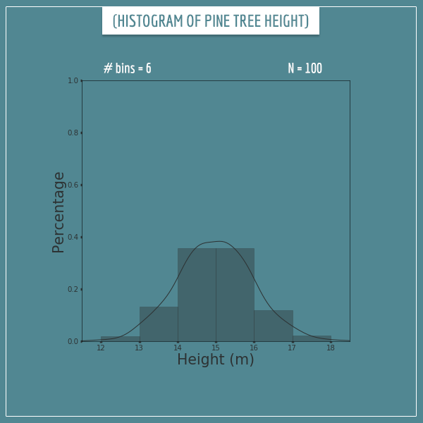
The y-axis shows the percentage of samples that fall within each bin. I also plotted a curve showing the closest probability density function that fits the histogram. It’s a pretty rough approximation to the original distribution, but you can see the resemblance, right?
Now let’s see what happens when we increase the number of bins to 12:
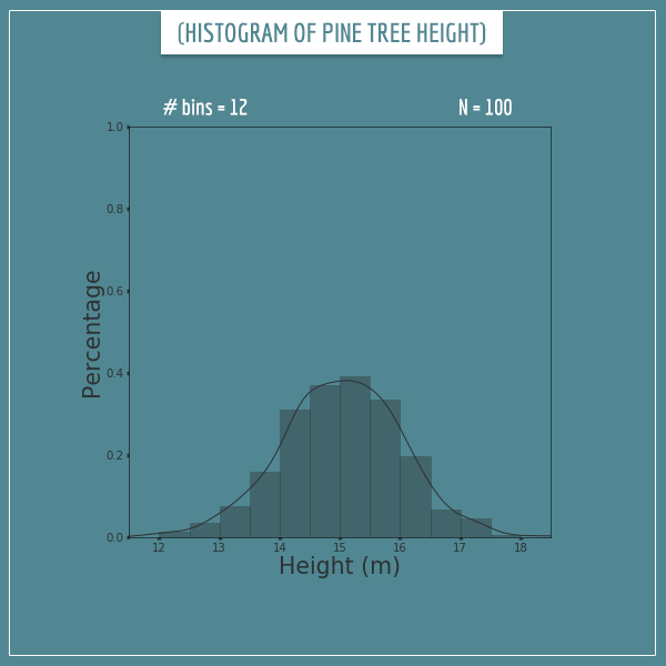
The number of samples is still 100, but this looks like a much better approximation, no? Now let’s split the sample space into 60 bins:
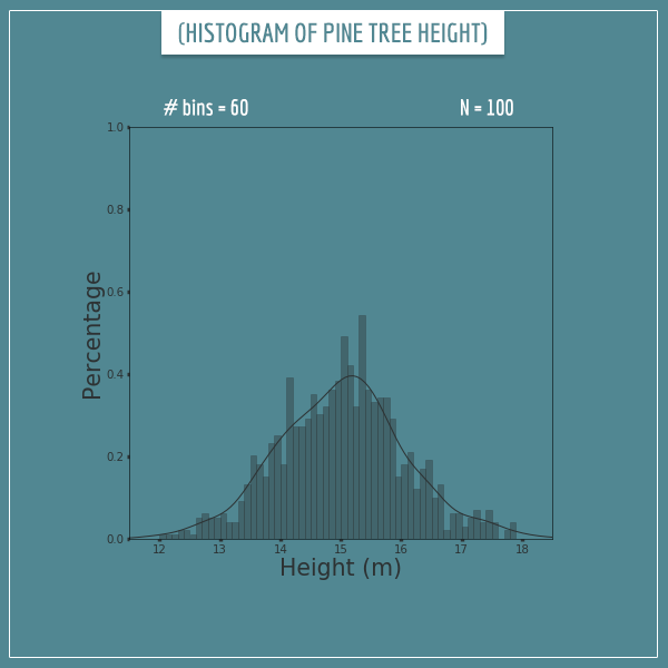
At first glance, this looks like a worse approximation, but that’s because 100 samples isn’t enough to sufficiently sample all 60 bins. So, let’s also increase the number of samples to 10000:
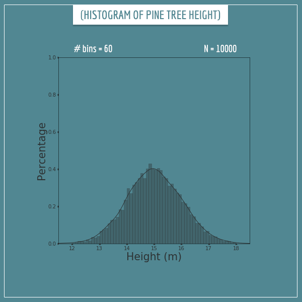
Now this looks much better! The height of the rectangles hasn’t quite converged to their corresponding theoretical limits, but the differences are very small.
In general, you will get better and better approximations by increasing the number of samples and the number of bins.
To satisfy ourselves, let’s see what happens when we generate 1 million samples and split the sample space into 120 bins:
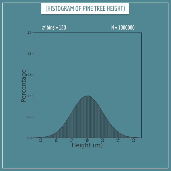
Well, that’s a great approximation. This histogram looks almost identical to the probability density function.
This section probably also gives you some intuition about why the probability of an interval of a continuous random variable is the area under the curve of its probability density function. When you approximate the function with a histogram, you would get the same probability by simply summing the areas of all the bins that cover that interval.
Summary
In this post, I defined probability distributions for discrete and continuous random variables as an assignment of probabilities or probability densities to all possible outcomes of a variable.
I introduced discrete random variables as variables which have gaps between their possible outcomes. On the other hand, continuous random variables have infinitely many possible outcomes between any pair of outcomes.
Every random variable has a total probability mass equal to 1. The point is to distribute this mass among all possible outcomes in a way that satisfies Kolmogorov’s axioms of probability. With discrete random variables, each possible outcome directly takes some portion of the probability mass. On the other hand, with continuous random variables each specific outcome gets a probability density (“mass per unit of sample space”) assigned to it.
With a few plots and simulations, I tried to show you that one way of thinking about probability distributions is as the theoretical limit of the relative frequency distribution as you generate more and more values from the random variable.
This post is meant to be a starting point for understanding probability distributions and in future posts I intend to cover deeper and more complex concepts related to them.
For example, distributions can be characterized by a set of different parameters like mean, variance, and skewness, which determine things like the shape and location of the distribution. In some of the next posts I’m going to introduce specific kinds of discrete and continuous distributions and show the intuitive meaning of their parameters (as well as how to calculate them).
In my next post, I discuss calculating the mean and variance of probability distributions.
As always, feel free to leave any questions in the comments below. Also, please share if you had difficulty following any part of the post.
Until next time!
Great post as usual. Your blog has really helped me a lot in getting an intuitive idea about probability and statistics.
However, I have a little doubt here.
“As you can imagine, creating a relative frequency distribution by sampling from the probability distribution doesn’t quite work the same way here. If you simply took the relative frequencies of individual outcomes, you would end up with zeros almost everywhere. This is because the sample space of a continuous random variable is some interval on the real number line. Hence, the number of elements of the sample space isn’t even countable.”
The way I understood this is, suppose I take 1 million pine tree heights as sample. Now since finding two tree with exactly same height is impossible, so all of the data is unique and therefore has a frequency is 1. So the relative frequency of them are 1 / 10^6 and would appear as a few speckles. But as you said since there are uncountably infinite real numbers in the sample space so, most of the places have relative frequency as 0. But why is this model incorrect? Is it due to the random scattering of points in such a vast sample space, this model would provide no help in statistical analysis?
Thanks.
Hi, Avik. Thank you for the nice words about my posts! Always happy to be helpful!
Yes, your understanding here is exactly right. To put it in slightly more general terms, if you generate N samples from a probability density function, you would end up with “probabilities” of 1/N for each sample you happened to generate and 0 for every other potential sample you could have generated.
I wouldn’t quite say this kind of a plot would be completely useless. The speckles that you end up generating will still be distributed more densely in places where the probability density function is high. So, visually it would still give you some idea about its shape.
It would be pretty useless in telling you anything about probabilities, however. To see why, imagine you generate N samples where N is, say, 10^6. Also, let’s say one of the samples you generated happened to be 14.3823. Now, if you attempt to conclude that the probability that a tree has a height of 14.3823 is (about) 1/10^6, how far away would you be from the true probability? Well, for starters, notice that the “probability” that was calculated with this method is completely dependent on the choice of N. If you had generated only 100 samples and again one of them was 14.3823, then the same analysis would force you to conclude that the probability of a tree having this height is (about) 1/100. A pretty big difference in the estimates!
If you took a tiny interval around 14.3823 (something like [14.382299999999, 14.382300000001] and generated a really large number of samples (in order to adequately sample such a small interval), you would get the real probability of having a tree with that height. Well, kind of. It would still be the probability of an interval, but it’s so small, it makes no practical difference.
Now, whether the 1/N “probability” is close to the real probability would be pretty much a matter of complete luck (dependent on whether you picked “the right” N).
Does this help?
Thanks for such a detailed response!
Yes, that does make a lot of sense.
Honestly speaking, I was kind of waiting for your posts on probability distributions. I am so glad that you started this series.
I’m looking forward to reading your posts on those specific distributions especially Poisson’s, Exponential and Normal Distribution.
Really enjoying your blog, many thanks!
In relation to the tree example you wrote “…I split up the sample space into 6 bins of size 1 m and generated 100 samples from the original distribution….” . This feels slightly unsatisfactory to me (a slight of hand nearly) and a bit of circular reasoning: Is it not expected that the samples you generate this way create the frequency distribution you display 🙂 seeing as the pdf is a normal distribution?
I understand this is the only practical way to do the simulation but I think it would be helpful to add that “ideally” you would select 100 random samples from the population and each sample (tree) has an equal chance of being selected. Only you cannot do this, since you do not have the tree population data to hand. You therefore simulate this, by using the pdf to return a “representative” sample data set?
Another question for me with the above is hinted at by your example of #60 bins and N=100 where you frequency distribution is starting to look a little noisy…
Taking this further if you tried #600bins say and N=100 it would look really bad and eventually with #bins>>N you would end up with a uniform frequency distribution with lots of empty bins. You wrote “…but that’s because 100 samples isn’t enough to sufficiently sample all 60 bins…”. That’s a rather nebulous statement. What does “sample a bin” mean?
Hey Patrick,
The point of the exercise is to show what would happen if we selected 100 random trees (if we did have the tree population data) and if the tree height indeed followed the same distribution as in the simulation. Now, in practice the real tree height won’t exactly follow a normal distribution. At the very least, negative heights don’t exist even though the normal distribution’s support (the part of its domain where the pdf is > 0) is the entire real number line. But we don’t particularly care about the empirical accuracy of my example, right? I made up the numbers anyway 🙂 In this context, I’m not sure the simulation approach is any more or less circular than directly selecting real trees. Can you tell me a bit more about what you mean by ‘circular’ here?
Regarding your second question, every time you generate a sample it falls into one of the bins, right? What I meant in the part of the post you quoted was that you need to have a large enough number of samples so that each bin can have a chance to have a sufficient number of samples falling in it for its probability to be adequately approximated.
For example, if you split the distribution into two equal-sized bins right in the middle, each will have a probability of 0.5. Let’s only focus on one of them (call it Bin 1). Now, say you generate only 2 samples from the distribution. If both samples fall inside Bin 1, you will approximate its probability as 1, which is way off. If neither fall in Bin 1, you will approximate it as 0, which is also way off. But if 1 out of the 2 samples falls in Bin 1, you will approximate its probability as 0.5, which is a perfect approximation.
Now say you increase the number of bins from 2 to some higher number and this time Bin 1’s probability mass happens to be 0.2 instead of 0.5. If you again generate only 2 samples from the distribution, your approximation for Bin 1’s probability can still be 0, 0.5, or 1, but all three of these are bad approximations of the real probability (0.2). Which means that with only two samples you don’t even have a theoretical chance to adequately approximate a probability of 0.2. On the other hand, if you generate 5 samples (instead of 2), then you still have a chance for a perfect approximation (if exactly 1 out of the 5 samples hits Bin 1).
Generally, the smaller a bin’s probability is, the larger number of overall samples you will need to adequately approximate it. Furthermore, the more bins you have, the smaller the average bin probability will be. From these two statements it follows that the more bins you have, the more samples you will need to adequately approximate the probabilities of all bins (which together represent the underlying continuous distribution).
Does this make sense? Let me know if my answer addresses your question or if there’s something I’m missing or misunderstanding.
Thank you for your in depth reply to my questions 🙂
My “struggle” with the above originates from a slightly different but related topic:
When reading elsewhere about sampling distributions it was stated that any sample is equally likely to be selected from the population. I struggled with this concept until I realized that – sticking with your forest example – what was meant was that every tree in the forest is equally likely to be selected in making up a sample of trees and indeed every sample of trees is equally like to be selected.
(The explanation then went on to state that to construct the (usually theoretical) sampling distribution, every possible sample would need to be taken from the population… but this is somewhat off topic).
What is not “equally likely” though is the heights of the trees that appears in any sample of trees from the forest. Samples will tend to have more trees in say the 1.45m-1.55m height range that in the 1.15m-1.25m height range due to the presumed normal distribution of the population.
Referring this back to my first question, I was trying to “tease out” a better understanding of the workings of this simulation: You are not (as you have confirmed) taking a random sample of trees from the complete population of trees that you happen to have measured. And to be pedantic about this, if you had a large indexed array of this population of trees, you would have used a random number generator to select the trees to return in your sample. So everything is totally random and equally likely…
Instead your simulation software generates samples by returning a set of trees whose heights are based on the pdf. So it is in that sense that I am (going on rather!) about the “circular” nature of the argument. I.e. if I am correct, you are in some way using the normal distribution pdf to create your sample, and then the bucket histogram not surprisingly has a hint of normality about it 🙂
* I re-read your answer and think you have already answered some of the above :). I am posting this in case it helps others who got stuck on this like me!
You’re definitely touching upon an interesting question. I think now I understand your initial question better, so let me address the aspect that I think I left out from my previous response.
When you say “random sample of trees from the complete population of trees that you happen to have measured”, you’re obviously assuming a finite population of trees. Think of trees as an infinite population: all trees that ever existed + all trees that currently exist + all trees that will exist in the future. You can think about it even more Platonically… Imagine an abstract world where all these possible trees of all possible heights exist. And, for example, every time you plant a new tree in the real world, it’s like you’re picking a random tree from this infinite population of possible trees. You may pick a tree that’s going to end up being 15 m, or 15.1 m, or any other real number. Which is the kind of process I’m simulating.
Does this clarify things a bit more?